MPM Seeds

Project Mandate
Rethink conventional seed packaging for a more environmentally friendly solution that is also visually striking, making the seed packaging experience more interactive. The client for this project is the Marchés publics de Montréal, a non-profit organization whose goal is to help local farmers, shopkeepers, and agri-food artists sell fresh, locally produced goods in Montreal.
Design Thinking
Oftentimes, seed packaging is visually monotonous, emphasizing the photos of the seed plants, and providing the reader with too much information. When the package is empty, it is likewise thrown. That in mind, my packaging would be more eco-friendly. Also, I’m looking for a typeface that will be simple to read and add to the enjoyment of learning about the plant. This concept was primarily inspired by the colourful fruits and vegetables available in the MPM market.
Design Making
To provide clients with a plant marker, the package’s front flap unfolds and is die-cut. Sowing the seed is easier with clear icons and instructions displayed on the envelope. In order to enhance the reading experience, I chose a sans serif typeface and experimented with a lot of negative space to avoid making the text too dense.
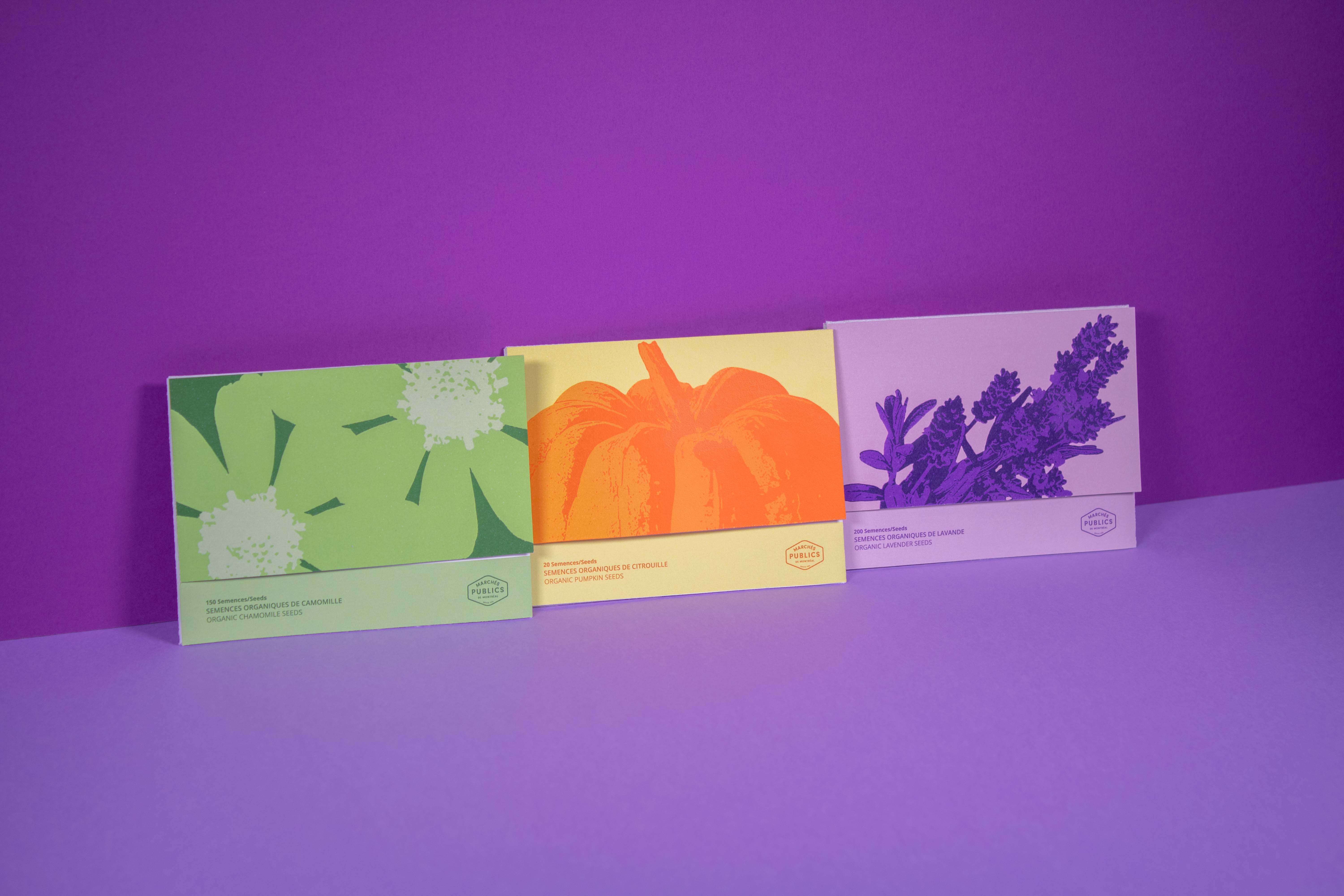
Three distinct colours are used in the seed packing design: orange is used for vegetables, purple is used for flowers, and green is used for plants. Customers that know exactly what they want to buy from the start benefit from this as it makes the search process simpler.
Three distinct colours are used in the seed packing design: orange is used for vegetables, purple is used for flowers, and green is used for plants. Customers that know exactly what they want to buy from the start benefit from this as it makes the search process simpler.
Project Mandate
Rethink conventional seed packaging for a more environmentally friendly solution that is also visually striking, making the seed packaging experience more interactive. The client for this project is the Marchés publics de Montréal, a non-profit organization whose goal is to help local farmers, shopkeepers, and agri-food artists sell fresh, locally produced goods in Montreal.
Design Thinking
Rethink Oftentimes, seed packaging is visually monotonous, emphasizing the photos of the seed plants, and providing the reader with too much information. When the package is empty, it is likewise thrown. That in mind, my packaging would be more eco-friendly. Also, I’m looking for a typeface that will be simple to read and add to the enjoyment of learning about the plant. This concept was primarily inspired by the colourful fruits and vegetables available in the MPM market.
Design Making
To provide clients with a plant marker, the package’s front flap unfolds and is die-cut. Sowing the seed is easier with clear icons and instructions displayed on the envelope. In order to enhance the reading experience, I chose a sans serif typeface and experimented with a lot of negative space to avoid making the text too dense. Three distinct colours are used in the seed packing design: orange is used for vegetables, purple is used for flowers, and green is used for plants. Customers that know exactly what they want to buy from the start benefit from this as it makes the search process simpler.


