Rirkrit Tiravanija

Rirkrit Tiravanija
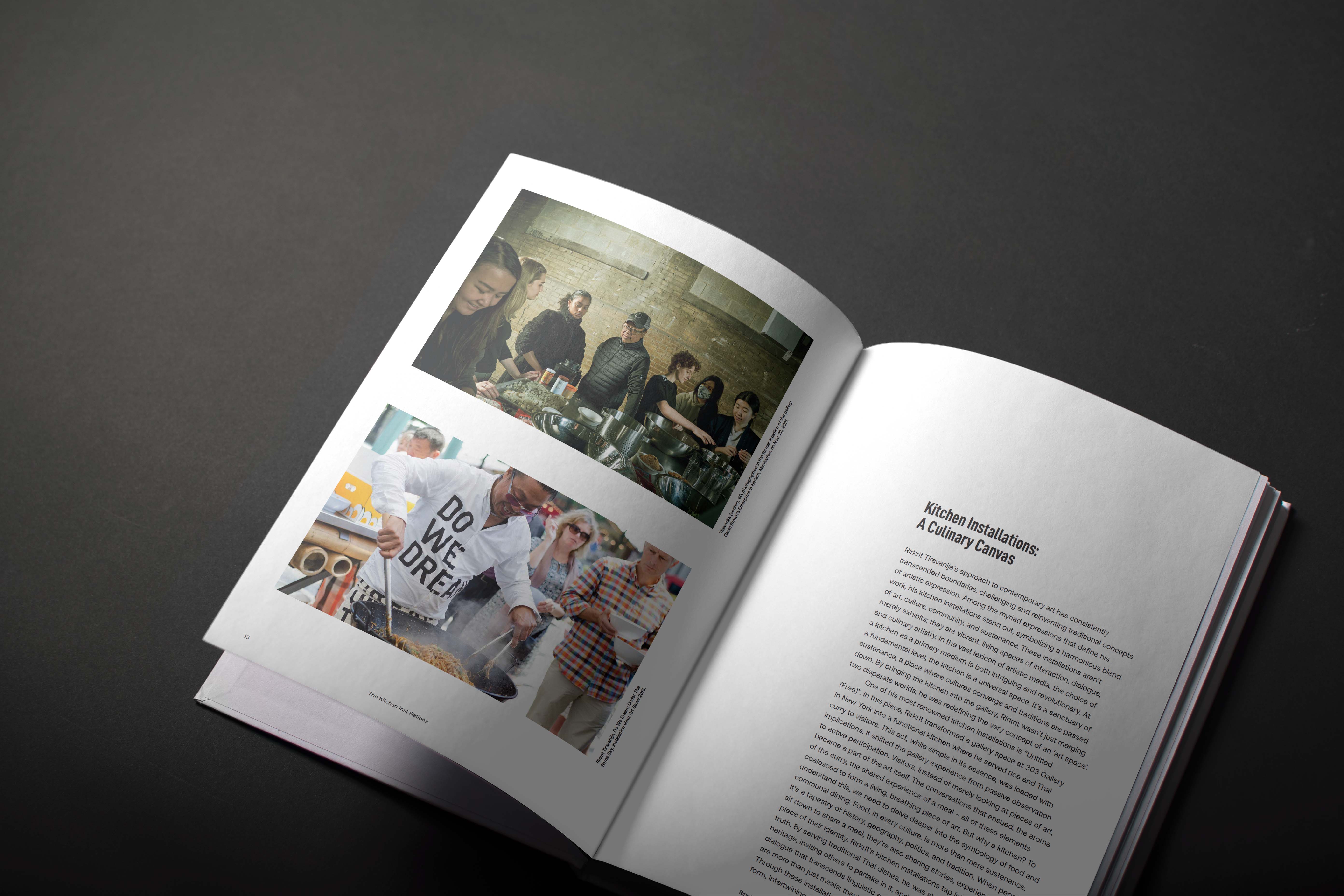
Born in Bueno Aires, Thailand, Rirkrit Tiravanija is a modern artist renowned for his relational aesthetics methodology. Through his interactive installations, gallery spaces created by Rirkrit Tiravanija become places where people may engage in casual conversations and savour freshly made Thai food. His goal is to obfuscate the distinction between the audience and the artist.
Project Mandate
Develop a brand-new book that tells the story of an artist’s life, career, and journey using compelling imagery, meaningful writing, and a novel approach to convey the artist’s message to the reader.
Design Thinking
My design ethos aimed to integrate form and function, fostering an immersive reader experience that mirrors the inclusivity and simplicity of the artist. With the image for the slipcase, I aimed to evoke the essence of Tiravanija’s collaborative ethos and minimalist aesthetic which invites readers to immerse themselves in his world of artistic dialogue.
Design Making
In order to create a slip case that is not only an addition of the book, but that is also part of it, die-cutting the typeface was the right way to go as it added more depth and intrigue to the design. The interactive nature of the artist’s participatory installations, where people can interact with the artwork, is also represented by the die-cutting. Since Tiravanija’s artwork frequently features simple forms, it was a fitting choice to use the sans-serif and minimalistic Aeonik typeface for the text. The layout is kept simple, as it uses a lot of negative sapce at the top of the page and a strong grid is evident.


